(evaluation on screen)
Hello my name’s Sarah Watson and this is my evaluation
Click
Question 1: ways in which my magazine follows the usual conventions of a typical media product.
Click
Firstly I started with the title of the magazine, I played around with different names like “beyond enough” but I finally settled on “subdivision” because it hints at music but its not too obvious when you look at the front cover, I wanted to use the word division because my magazine is all about 2 things, fashion and music. The font was the next major factor to be discovered, this was my first choice, which I later decided that it was too childish and not eye catching enough.
Click
This was my final decision, I think it’s a lot more edgy than the other one and its definitely more unusual and striking.
Click
I used the kerrang masthead as inspiration because I think it attracts the reader.
Click
I also used this NME front cover as my muse because I really like the simplicity but effectiveness of the layout.
Click
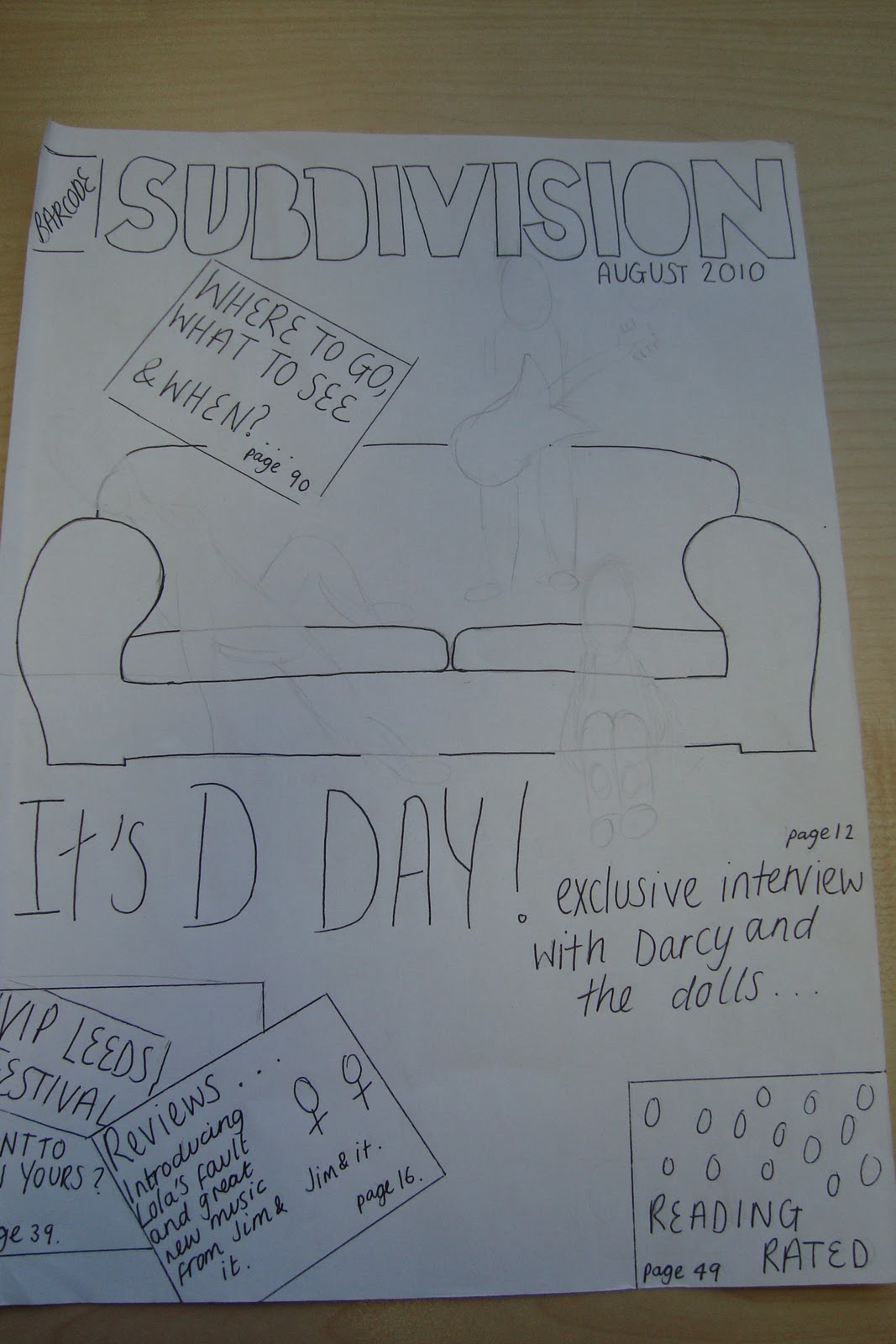
This is my front cover; I used the layout of cover lines like the NME cover by listing them all down one side and also made the image and the masthead the main feature.
Click
Moving inside the magazine, this is the double page spread. Because there is a lot of writing on this page I decided to make it more exciting by adding a coloured background (which also ties in with my contents as you’ll see later) and lots of pictures of the band. This not only helps the reader see the bands personality but also showcases their personalities. (zoom in on bottom photos.)
Click
Throughout my magazine I have used a very relaxed tone of voice which appeals to the audience and creates a personal connection. For example, this is a few of the questions I asked the band. It helps get the readers involved in the bands development and introduces the band.
Click
This is my contents page, I kept the picture theme running through here aswell and also he relaxed tone of voice. Which is shown in the editors letter.
Click
Question 2: my main image evaluation:
Click
I started with this image which was found on flickr while I was researching possible front cover ideas,
Click
As was this one. I really liked the movement that the action and the snow gives so I decided to portray this in my main image as well.
Click
This is a picture from q magazine of paramore jumping; I also used this for inspiration when creating my image.
Click
This is my main image.
Click
These are a few of my outfit options for my photo shoot. These outfits were very much about bringing a 'cute' accent to the band, while still giving it a hard edge by using the boots and lots of lace. These two outfits were more about the provocative side of the band and give a "morning after" look, which hints at their feisty personalities and the music of the band.
Click
Question 3: The media institution
Click
If I could choose I would like my magazine to be produced by the Bauer media group because they are one of the longest running publishers in the world and are also a family business, therefore they are very experienced and would know exactly where and how to develop my magazine and create the best publication possible. They have many different denominations including TV channels and radio station which would be perfect to promote and encourage my own magazine. Their domain also rages over 14 countries which is perfect exposure and shows that they know exactly what they’re doing.
Click
They also own magazines such as Kerrang and
Click
Q, which were both big inspirations for my own magazine.
Click
Question 4: This is the typical audience that my magazine represents.
Click
-zoom out-
(explain points)
Click
Question 5: these are the features which I used to attract my audience.
Click
My audience is all about being cutting edge and ahead of the trends, so I decided to maximise this within my magazine.
I used a simple colour scheme of white and duck egg blue which I think gives it a very contemporary feel and the crinkled paper effect on both the double page spread and contents page create interest and make the magazine unusual.
The font which is used throughout the magazine is also very modern and gives the magazine an edge.
The images within the magazine are also exciting and create depth because they have been edited to both increase their colour and make them stand out or I made them black and white and boosted the contrast which looks creative and makes them more prominent.
The clothing that the models are wearing also appeals to the audience is very on trend and cutting edge.
The main feature on the front cover is the paperclip holding the piece of paper with the band’s name on, I really like this feature because it is unusual and makes the band’s name, which is the most important thing on the page become more noticeable.
Click
These are the answers to my audience questionnaire.
Click
Question 6: these are the technologies I used to create and develop my magazine
Click
I used macromedia fireworks to create my magazine; this gave me all the necessary features which I needed to create the best magazine possible. Before I started this project I was a complete novice at this program but now I’d say I was competent and I can use features which I never knew existed.
Click
Microsoft office picture manager was my main tool when editing images. I used this to play with the saturation, the contrast and the brightness within the images as well as cropping and red eye correction.
Click
I used Microsoft office PowerPoint to create slideshows and presentations to add to my blog and showcase my work.
Click
I also used Microsoft office excel, this was to create graphs and pie charts to illustrate the results from my questionnaire.
Click
Prezi was used to create this presentation. I hadn’t used this website before and after a few days of learning the features I decided that it was the best programme for the use I needed and the display has clean lines and looks professional.
Click
I used Blogger to create my own blog which I then used to display and hold all the information about my project.
Click
This is a screenshot from my blog.
Click
When displaying my presentations which I created on PowerPoint, I used slideshare to convert this into a display suitable for my blog.
Click
This is a screen shot from the Slideshare website.
Click
I used photo bucket to display large amounts of pictures on my blog.
Click
This is a screenshot of the photo bucket website.
Click
-zoom out-
These are the hard ware that I used to produce my magazine, the digital camera to take pictures and then connect to my laptop where I then edited them and produced my magazine. I also used a USB memory stick to transport files between school and home so that I could create different elements for the magazine in different places, then combine them.
Click on preliminary task
Question 7: what I have learnt from looking back at my preliminary task.
Click
-Zoom out –
Looking at my products side by side it shows the progression I have made. My school magazine front cover has no structure and the articles are all over the page, whereas the features on my music magazine are organised into a easy to read list on one side of the page.
Also throughout my preliminary magazine I have used a very generic font which gives the magazine a look as though anyone could have made it, whereas in my music magazine I used a very unusual font for not only my masthead but all the text throughout the magazine.
My music magazine also contains all the features that a real magazine would include, for example a barcode and price, which makes it look more realistic and professional than my school magazine.
The contents page for my music magazine also looks much more appealing and exciting because it contains bright images and a more efficient layout.
In order to create a better magazine I did a lot of practise with the software and learnt lots of new qualities such as the text effects and image modifying features. I also spent more time researching what my audience wanted and planning exactly what I wanted my magazine to include. A combination of practise, learning and research enabled me to create a successful and more aesthetically pleasing magazine, which I am proud of.


